ReWork Branding
ReWork App Design and Branding
ReWork is a conceptual application that serves as an online marketplace for art students to buy and sell used supplies, materials, and textbooks on campus or in local areas. This project was a two-month exercise wherein I researched and developed a brand for the application, as well as user-tested wireframes, a working prototype, and an animated proof of concept video detailing the function of the app.
Project deliverables included research documents, a finalized style guide, a working UI prototype with all key screens, UI guidelines, and an animated motion piece to be used as a proof of concept. The imagery was developed to appeal to art students in their 20s-30s, primarily lower-income students with tight budgetary needs.
Visual Development
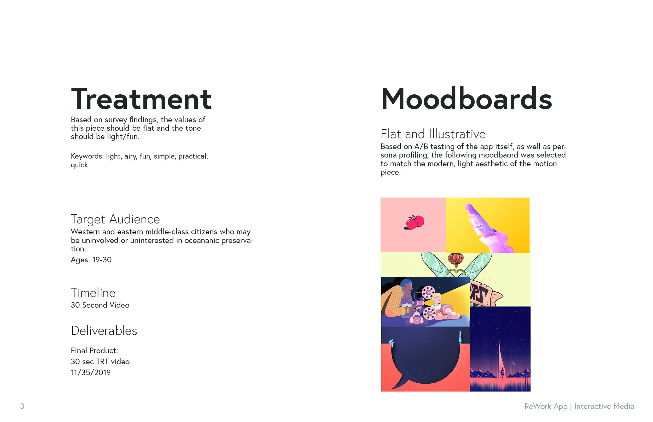
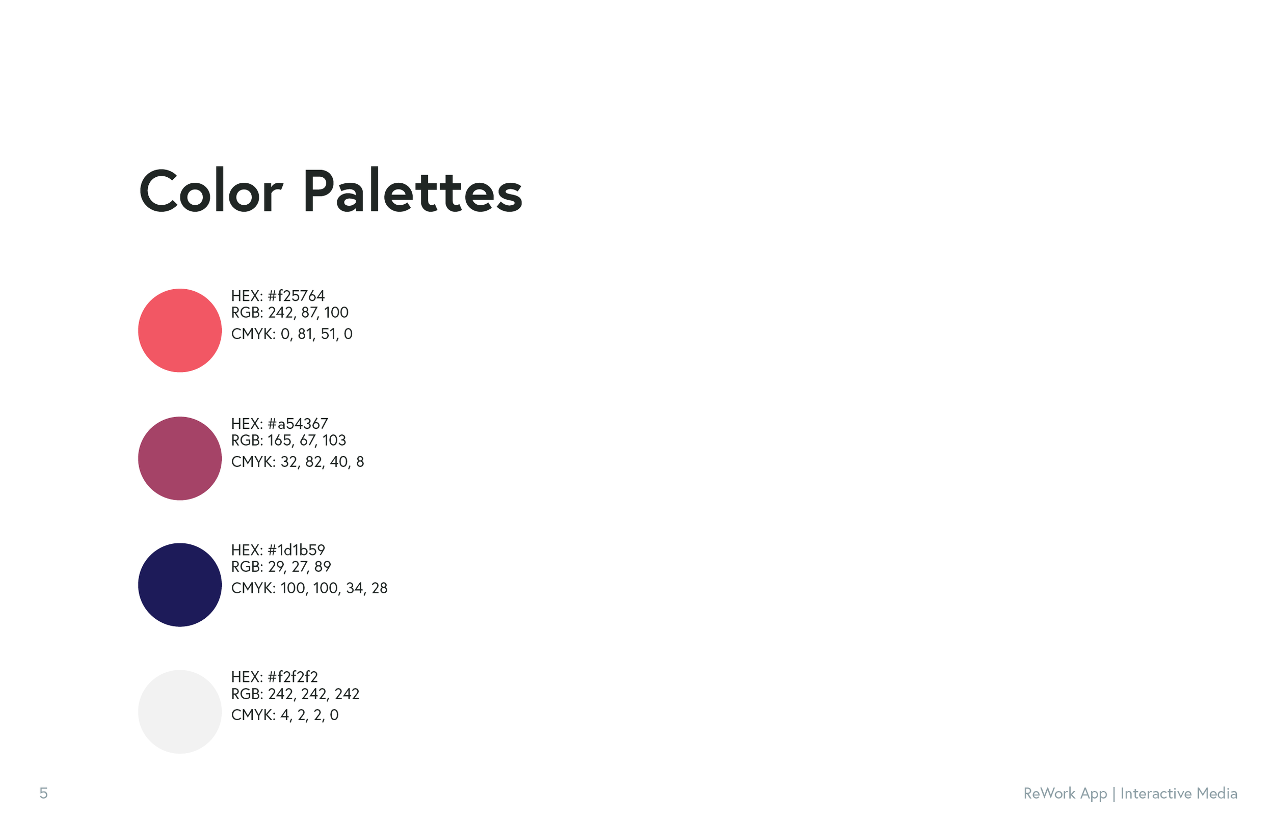
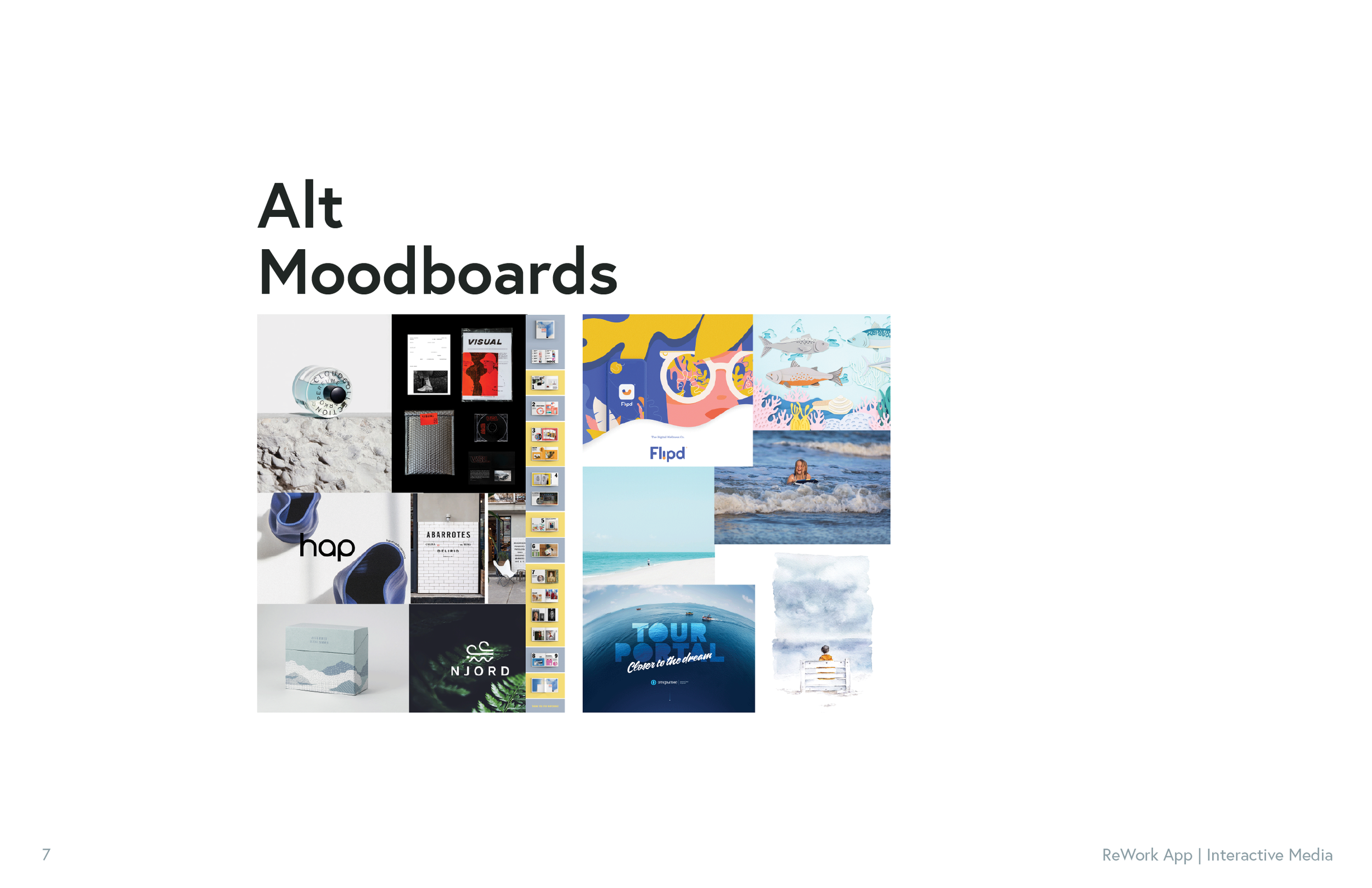
The style guides and imagery for the app were developed over two weeks and were tested through a process of quantitative and qualitative user testing. A targeted group of art students, whose majors ranged from graphic design to illustration to photography, were prompted with a set of moodboards and color palettes and asked to choose an aesthetic that felt comforting/welcoming. Based on the need to make the app feel accessible to potentially financially restrained students, the look and feel were developed with a creative and organic tone.
Motion Design Development
The motion design piece was concepted and designed over two weeks with a cut limit of 2 minutes. The goals of the piece were to showcase the functionality of the app, demonstrate the safety of using such an app, and highlight the financial benefits of ReWork. Utilizing the aesthetics of the app itself, the motion piece follows a linear narrative of one potential user.
Full Style Guide & Product Presentation
