Strand | VR Short Film
STRAND | Style Development
Overview
Strand is an experimental Virtual Reality short film developed around the topics of industrialization and colonization, encouraging the viewer to engage with heavy existential topics through a colorful and engaging virtual environment. The target audiences are adult audiences with an interest in art and conservation, though the film is available to children as well. The objectives of the film are to provide a space for the viewer to consider environmentalism without judgement or “finger-wagging”.
Developing the visuals for STRAND, I was tasked with creating a style guide that was both visually interesting and technologically efficient. The simplified models and character designs of the project served to create a light, fun atmosphere to an otherwise morbid narrative. Additionally, these aesthetics served a technical function. The final film, living as a VR production on YouTube, was anticipated to be hardware intensive, and so the aesthetics of the project had to capture the surreal beauty of the film in a simple, non-GPU-intensive capacity.
Process
Moodboard
The need for cel-shading as a GPU-efficient rendering technique became apparent very early on in the process. This unique, stylized representation of form would allow for low-poly models while simultaneously serving the aesthetic function of a fun, surreal, alien environment.
Style Development
Having developed a general aesthetic direction, I began sketching out rough landscape and character models in Cinema-4D, running render tests to revise the efficiency of my workflow. I also developed a general color palette and typography guideline to guide the aesthetics of the project, taking into consideration the flat-color effect of cel-shading as well as the fun, surreal, and sci-fi elements of the film’s subject matter. The visual aesthetics promised a surreal, mildly humorous setting for casual viewers, allowing them to engage with the content without a feeling of commitment or extreme seriousness.
Storyboard Sketching
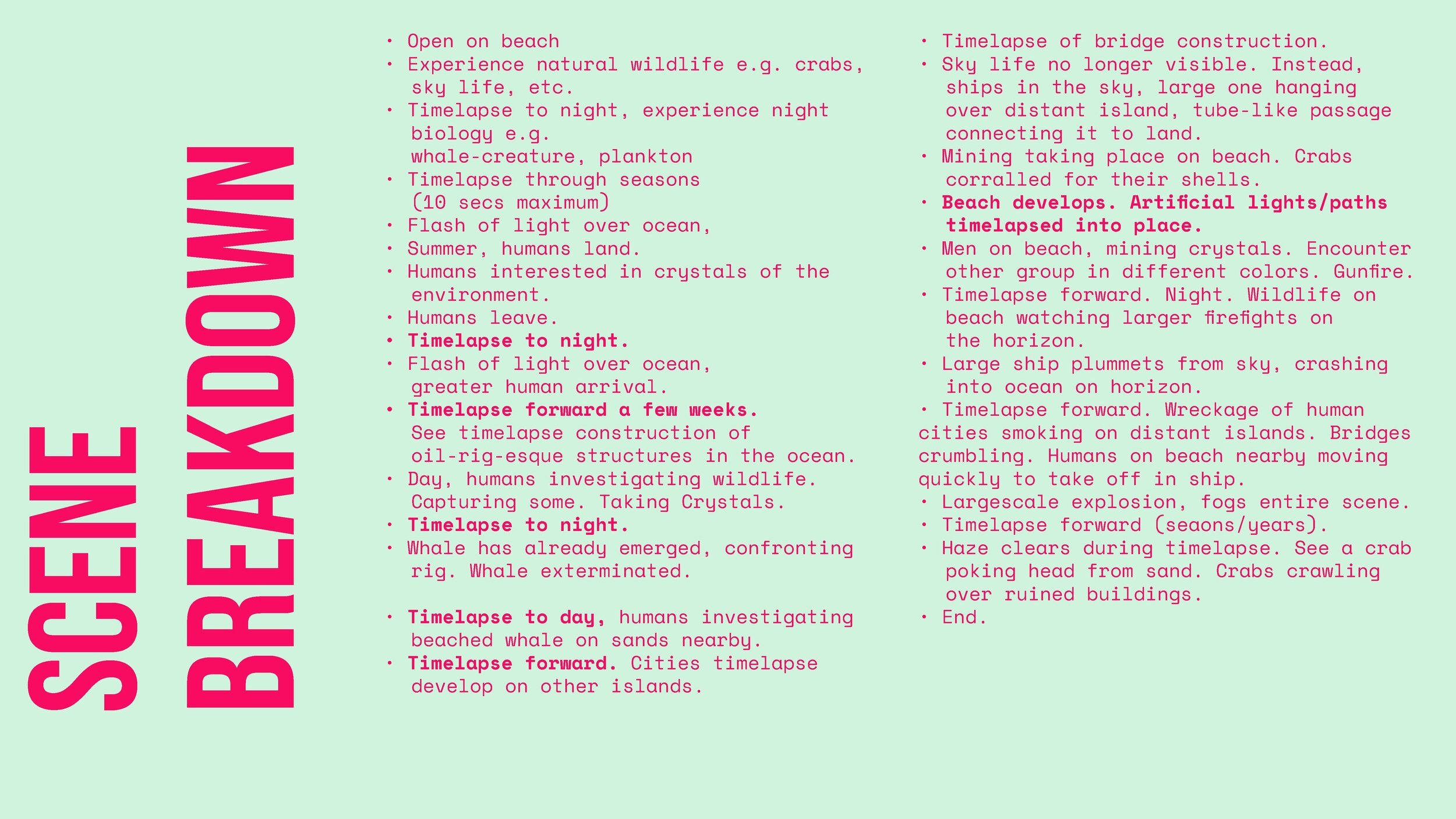
With a tested visual styleguide in place, I began applying the proposed visuals to the narrative of the film, developing color keys and rough storyboards to better understand the progression of shapes and colors throughout the film. To keep provide visual diversity and guide the viewer’s experience without a heavy-handed narrative approach, I developed tones in correlation with the hours of the day; light-hearted events take place in the brighter color schemes of the morning, while more intense or focused events take place at night.
Complete Styleguide


